
Introduction
Many online stores don’t suffer from a traffic problem; they suffer from a conversion problem. Visitors arrive, browse a few pages, and then disappear without adding anything to cart. If you are investing in ads, SEO, and social media but sales are not growing, the real issue is often buried inside your store’s design choices. Subtle decisions in layout, structure, and messaging can quietly block people from buying, even when your products and prices are competitive. In this article, we’ll look at five design decisions that silently kill revenue and what you can do to fix them before they cost you another sale.
Why Design Matters More Than Discounts
Discounts feel like the easiest lever to pull when sales slowdown, but a weak design can erase the benefit of any offer. If your website looks cluttered, loads slowly, or feels hard to navigate, visitors will not stay long enough to notice your coupon codes. Good e‑commerce design reduces friction at every step: finding the right product, understanding its value, and completing payment without confusion. That is why smart brands treat design as a growth lever, not as a cosmetic layer that sits on top of everything else. When a store is structured well, even modest discounts perform better, because shoppers trust the experience and feel comfortable buying.
Design Decision #1 – Confusing Navigation and Product Categories
Your navigation is the map to your store. When the map is messy, people get lost and give up quickly. Common issues include category names that only make sense internally, menus with too many levels, and filters that hide more than they reveal. A visitor who cannot quickly answer “Where do I find this product?” will bounce, especially on mobile. From an SEO standpoint, unclear navigation also makes it harder for search engines to understand your site’s structure, which can affect rankings and how often your pages are crawled.
A better approach is to build categories around how customers actually search and talk about your products. Keep top‑level menus lean, with clear labels that match search intent, and use filters to refine, not replace, categories. Internal links from blogs and landing pages into these main categories also help both users and search engines. If you work with a seasoned E-Commerce Development Company, they will usually start every redesign with a content and category audit before touching visuals.
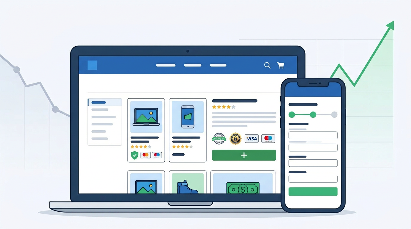
Design Decision #2 – Weak Product Pages with Thin Content
Product pages are where decisions are made, yet they’re often treated like placeholders. Short, generic descriptions, a single image, and no supporting information leave people unsure about what they’re buying. Thin content also limits your ability to rank for long‑tail queries like “comfortable men’s running shoes for flat feet” or “organic skincare kit for sensitive skin.” When shoppers still have questions after reading your page, they either search elsewhere or abandon the idea of buying altogether.
To turn product pages into sales pages, focus on clarity and reassurance. Use multiple high‑quality images that show scale and detail, add benefits‑oriented descriptions instead of just features, and include practical information such as sizing guides, materials, and care instructions. A small FAQ block that answers common objections can remove last‑minute doubts. Well-structured product pages also help your SEO efforts by providing meaningful text and headings that search engines can understand and rank.
Design Decision #3 – Slow, non‑Responsive Layout on Mobile
Most e‑commerce browsing now happens on phones, yet many stores still load slowly and behave badly on smaller screens. Heavy sliders, uncompressed images, and complex scripts can add seconds to each page load. On a mobile network, those seconds feel endless and create a perception that your site is unreliable or outdated. Sluggish performance is one of the fastest ways to lose customers, and it also affects search visibility, because speed and mobile friendliness are strong ranking signals.
A responsive layout is more than shrinking the desktop design. It means prioritising content that matters, simplifying navigation, and ensuring important actions (like “Add to Cart” and “Buy Now”) are always easy to reach with the thumb. Compress images, remove unnecessary animations, and test key flows on different devices. If you do not have in‑house technical capacity, partnering with a specialist website design company in Ahmedabad that understands both design and performance can make a noticeable difference for your store’s mobile conversion rate.
Design Decision #4 – Cluttered Checkout and Hidden Costs
Checkout is where intent turns into money, and yet it’s often where friction peaks. Long forms, repeated fields, forced account creation, and unexpected fees are classic conversion killers. Shoppers are sensitive to anything that feels like a hassle or a surprise, especially when they are seconds away from entering their payment details. Hidden charges, such as extra handling fees revealed only on the final step, create a feeling of being misled and can lead to abandoned carts and negative word of mouth.
A clean checkout experience is short, transparent, and reassuring. Ask only for information you truly need, offer guest checkout alongside account creation, and show progress indicators so customers know how many steps remain. Display total costs, including shipping and taxes, early in the process rather than at the last moment. Trust badges, clear return policies, and contact options around the checkout also help, because they signal that a real team stands behind the store.
Design Decision #5 – Poor Use of Trust Elements and Social Proof
People hesitate to buy when they cannot judge whether your brand is reliable. Many e‑commerce sites make the mistake of hiding testimonials, reviews, and guarantees in small text or separate pages. Others rely on generic stock badges that have no real meaning. Without visible proof that real customers have had good experiences, potential buyers are left with unanswered questions about quality, delivery, and support.
To counter this, weave trust elements into the core design rather than adding them as an afterthought. Highlight reviews on product pages, show ratings near product titles, and create a short “Why People Trust Us” section on key landing pages. Include real logos of payment providers, security certificates, and any third‑party platforms where you’ve been rated. For service‑driven stores or custom projects, case studies and before‑and‑after examples can be more persuasive than numbers alone. Good design brings these elements forward without overwhelming the layout.
How to Audit Your E‑commerce Website Design
You don’t have to guess where buyers are dropping off. A simple audit can reveal where your design is blocking conversions. Start by walking through your store as if you were a new visitor: search for a specific product, add it to cart, and complete checkout on both desktop and mobile. Note any point where you feel confused, have to think too much, or wait too long. Compare that experience with analytics data such as bounce rate, exit pages, and cart abandonment to see where patterns line up.
Next, review each of the areas covered in this article: navigation, product pages, mobile performance, checkout flow, and trust signals. Make a short list of issues under each and rank them by impact and effort. Fixing a confusing menu label may be faster than rebuilding your checkout, but both will matter over time. This structured audit gives you a clear roadmap instead of a vague feeling that “the website isn’t working.”
When to Call a Professional E‑commerce Web Development Team
Some improvements are easy to handle internally; others require specialised skills. If your platform is outdated, your theme is heavily customised, or you rely on multiple plugins that conflict with each other, quick fixes may only patch symptoms. At that point, bringing in an experienced E-Commerce Development Company can save time and protect you from costly mistakes during upgrades or redesigns. A good team will not only refresh the look of your store but also align structure, performance, and content with your business goals.
Working with professionals is especially helpful when you want to connect your store with other systems such as inventory management, CRM, or marketing automation. It also matters if you plan to expand into new markets or product lines and need a scalable foundation. For businesses in and around Gujarat, partnering with a reliable website design company gives you the advantage of local communication along with global‑standard execution, which is important when your e‑commerce site is a primary revenue channel.
Conclusion
Design will never replace a good product, but it often decides whether a good product gets a fair chance to be sold. Confusing navigation, thin product pages, slow mobile experiences, cluttered checkout flows, and weak trust signals can quietly drain your revenue even while traffic appears healthy. By identifying and correcting these issues, you can unlock more value from the visitors you already attract. A thoughtful redesign, supported by solid development and ongoing optimisation, can turn your store from a digital catalogue into a reliable sales engine.
Frequently Asked Questions (FAQs)
Look for symptoms like high bounce rates, low time on site, abandoned carts, and many visitors dropping off on product or checkout pages. Combine analytics with a manual walkthrough of your store to spot friction points.
There is no fixed rule, but most serious stores review their design every two to three years, or sooner if performance drops, technology moves on, or the brand evolves significantly.
Yes. Simple changes like clearer category labels, better product photos, or a shorter checkout form can quickly improve conversions because they remove unnecessary friction from the buying journey.
You can handle basic tweaks in‑house if you have the skills and time. For deeper structural changes, platform migrations, or performance optimisation, working with an expert E-Commerce Development Company or a seasoned website design company is usually more efficient and safer for your live store.
Better design often supports SEO by improving site structure, internal linking, content depth, speed, and mobile friendliness. These factors make it easier for search engines to crawl and rank your pages, while also giving users a smoother experience.