
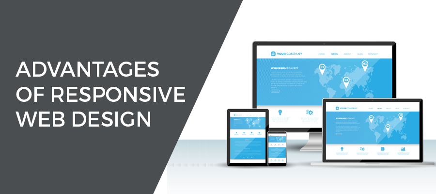
Whether you are a beginner or a seasoned web professional, creating responsive web design can be confusing. Over the past years, responsive web design has created a buzz in the market. User expectations also change with the changing trends in web browser functionality. Responsive website design in India or elsewhere involves an approach to web design that allows web pages to be viewed in response to the size of the screen or web browser that one is accessing the website on such as smartphones, tablets, desktops etc. Web development services in India are now drifting towards responsive web designs to cater to a growing mobile user population. Here are some of the advantages of using responsive web design.
Increase Sales & Conversion Rate
One of the benefits of responsive design is that the user has an improved site experience as there is no need for redirection, use of standardized Style Sheets (CSS) across devices. The unified design approach will also create a consistent look and feel. Consistent user experience will have a positive impact on your conversion rates as people are familiar with the navigation of your site or system use across devices. Responsive design removes some of the barriers that having multiple sites for multiple devices can present such as problems with functionality, performance and having a consistent look and feel.
Saves Time & Cost Effective
Another benefit of adopting a responsive design is that it takes less time than creating an additional stand-alone mobile site, which has been the traditional approach. Testing across a number of websites also increases your development, support, and maintenance overhead. Styles are re-used and optimized by device standardized testing methodologies can also be used. It can be easier for clients as it consumes less time to manage and maintain a single site. A single administrative interface can easily be optimized using layout and workflow tools to manage the right content that is being used for different devices.
Increases Reach to Mobile Audiences
The driving force behind creating responsive designs is to increase the use of internet and proliferation of web applications on mobile devices. Earlier users were redirected to a device specific site but with the evolving trend of responsive design, it is easier to establish the implementation of one site across devices. More than half of the traffic to websites comes through mobile, so it is crucial to increase the reach of your website to a mobile audience as there is where potential customers can be targeted at large.
Enhances User’s Online & Offline Browsing Experience
Responsive design allows site owners to deliver great online and offline browsing experience. When the user visits your website for the first time, regardless of the device, they can experience a smooth, consistent and positive experience. Responsive web design makes it easy for users to continue viewing content on your website within HTML 5 web application without an internet connection.
In light of the increase in the use of smartphones and tablet devices, creating responsive web design is the key to stay ahead of your competitors.